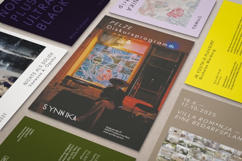
Synnika
For the »experimental space for practice and theory« in Frankfurt's Bahnhofsviertel district, we developed a minimalist and flexible corporate design that focuses on the respective projects.
Based on the distinctive »reverse italic« font style of the Ano typeface, we designed a logo system that emphasizes the experimental character of the space.

Few, but clearly defined guidelines, such as greatly increased character spacing in headings and asymmetrical margins, ensure recognizability.